One Theme, Dozens Of Layouts
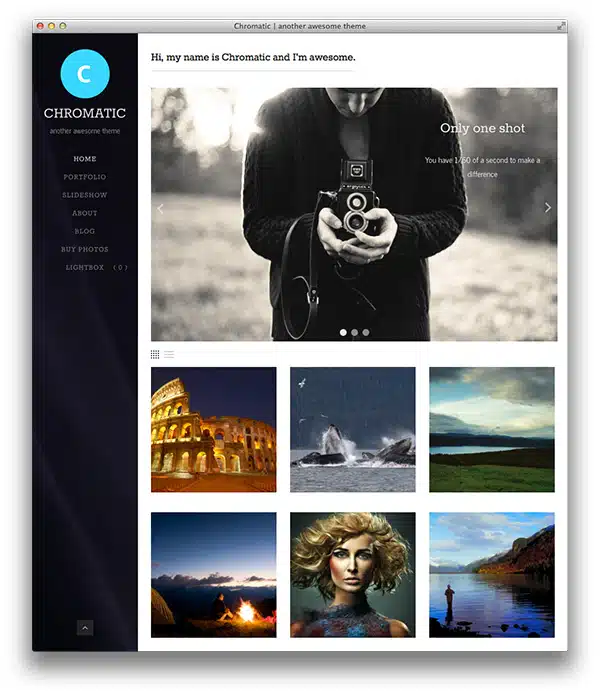
We’ve combined just the right amount of theme options and page templates to make Chromatic incredibly flexible, yet easy to setup. In total, Chromatic gives you about two dozen different layout combinations to choose from (page templates, colors, columns, slideshows, custom headers, background images, selling options, fonts, etc).
Go Fullscreen
All gallery slideshows can now be toggled into fullscreen mode. And if you have the Sell Media plugin activated, all images you have posted for sale can also be displayed in fullscreen mode. Bigger is definitely better.
Sell Online
Sell image downloads and prints (optional upgrade) directly out of Chromatic and WordPress when you activate our free Sell Media plugin. Sell directly from the homepage.
Flexible Portfolios
Choose horizontal, vertical or square image layouts on the homepage and archive pages. Choose between two, three or four column layouts and allow your site visitors to toggle from grid to list view.
Parallax Effects
Subtle design features like the parallax effect seen on slideshow titles and the fly-in, fly-out effect applied to the left-side menu navigation set Chromatic apart.
Content Is King
Chromatic is highly functional yet the design fades into the background to allow your content to shine through. The main site navigation and the footer content can be opened and closed with a simple mouse click.
Responsive
Chromatic includes responsive layouts optimized for phones, tablets and desktops.

