Evolution is a simple, classic design, but with a twist; it is our first fully responsive design. What makes the theme so special is its ability to adapt to various screen sizes on the fly without using any special browser detection and without having to re-load the page. The theme has four distinct layouts, each of which are triggered at specific window sizes. When viewed on a mobile phone or tablet, the design will degrade elegantly, and will even change when the device is flipped between portrait and landscape orientation. To view the changes in action, just try reducing the width of your browsers window when previewing the theme.
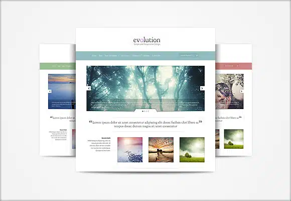
Evolution Features
1. Four Unique Colorschemes – Evolution comes with four different colors to choose from, including White, Blue, Green and Red. You can switch between these different colors at any time from within the ePanel theme options page.
2. Four Distinct Design Variations – Evolution come with four different layouts, each of which are served to your users based on their screen size. Each layout has been tailored to improve the usability of your website when viewed on smaller screens.
3. Improved Experience For Mobile Visitors – When using Evolution, there is no need to use third party mobile plugins or alternate mobile themes. Evolution will display beautifully on smaller screens due to its responsive nature. It will even change when the phone or tablet is flipped between portrait and landscape mode through the use of CSS3 media queries.
